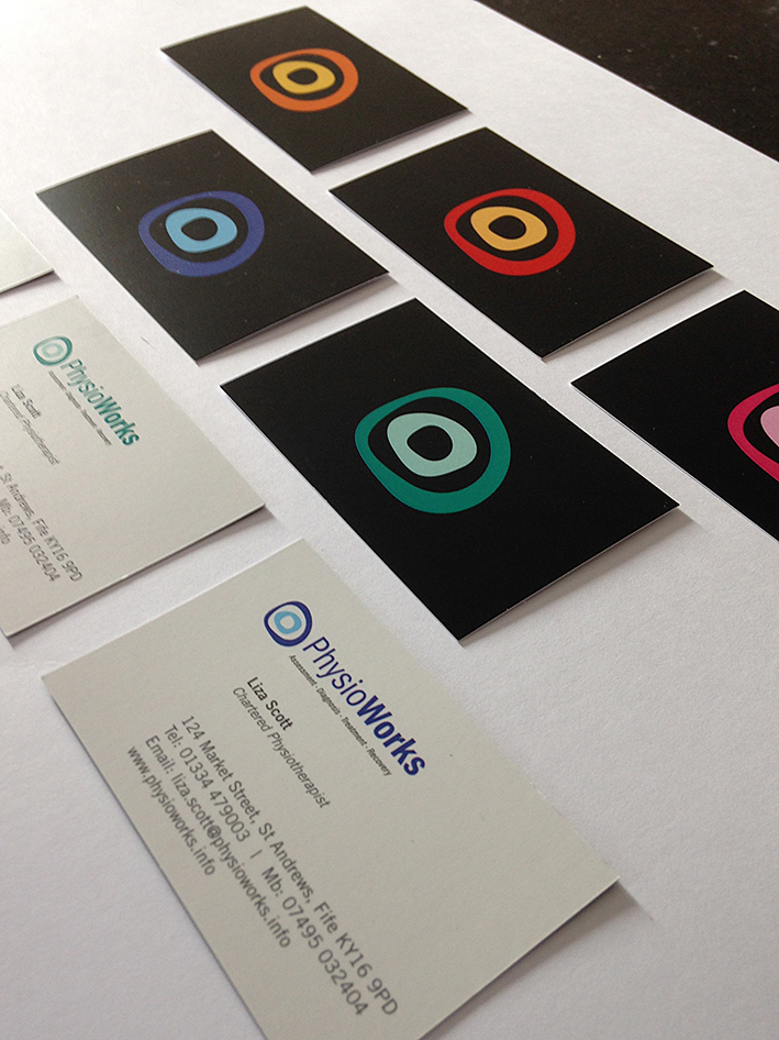
To kick off the new business Greybridge Design have created a new identity for the company. Creative Director Sandy Mitchell explains, “The main focus for the new logo and all the marketing materials was to appear fresh, contemporary and innovative. We wanted PhysioWorks to reflect Liza’s personality and stand out as something new and appealing.
“The ‘lozenge’ symbol was originally created by looking at bone and discs. It has since evolved to suggest a more rounded hollistic approach to treating the ‘whole person’and as a symbol, is flexible, both physically and in approach.
“The various colour combinations of the lozenge help illustrate the various areas of practice and add to the overall contemporary look and feel of the identity.
“The imagery and typography are intended to be soft and light with a conscious use of white space to reflect the calm, soothing and natural nature of the treatments.”
Sandy works both locally, nationally and internationally. Recent local projects include the new brand identity and marketing materials for Links Golf St Andrews, (We Are) Zest and BID fashion initiative STAFF. He also created the logo and brand identity for Chelsea Football Club and designed projects for Nike, Adidas, Disney, GlaxoSmithKline amongst others.


Add Comment